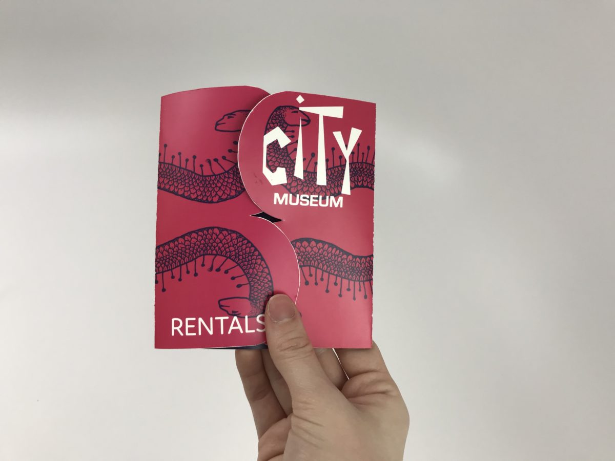
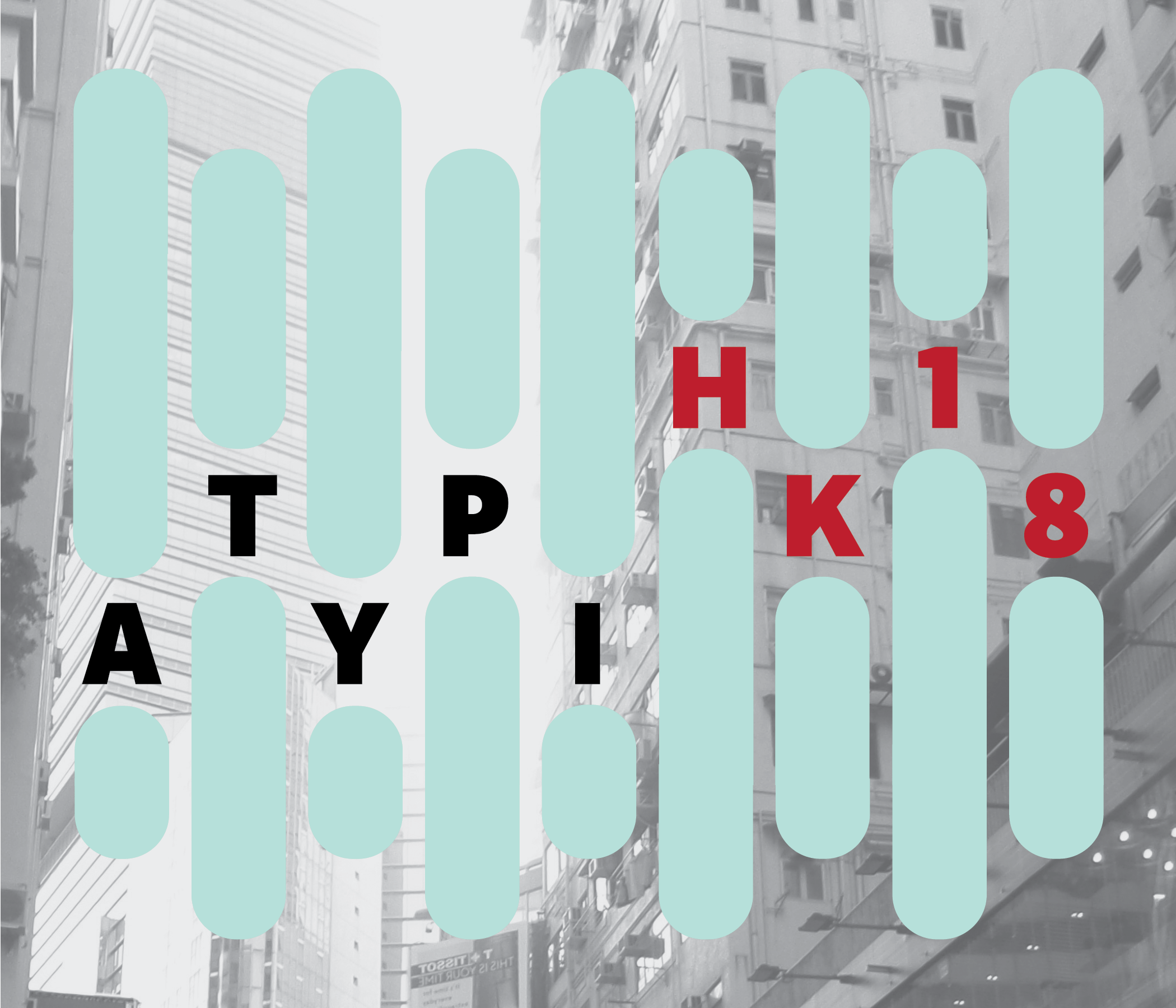
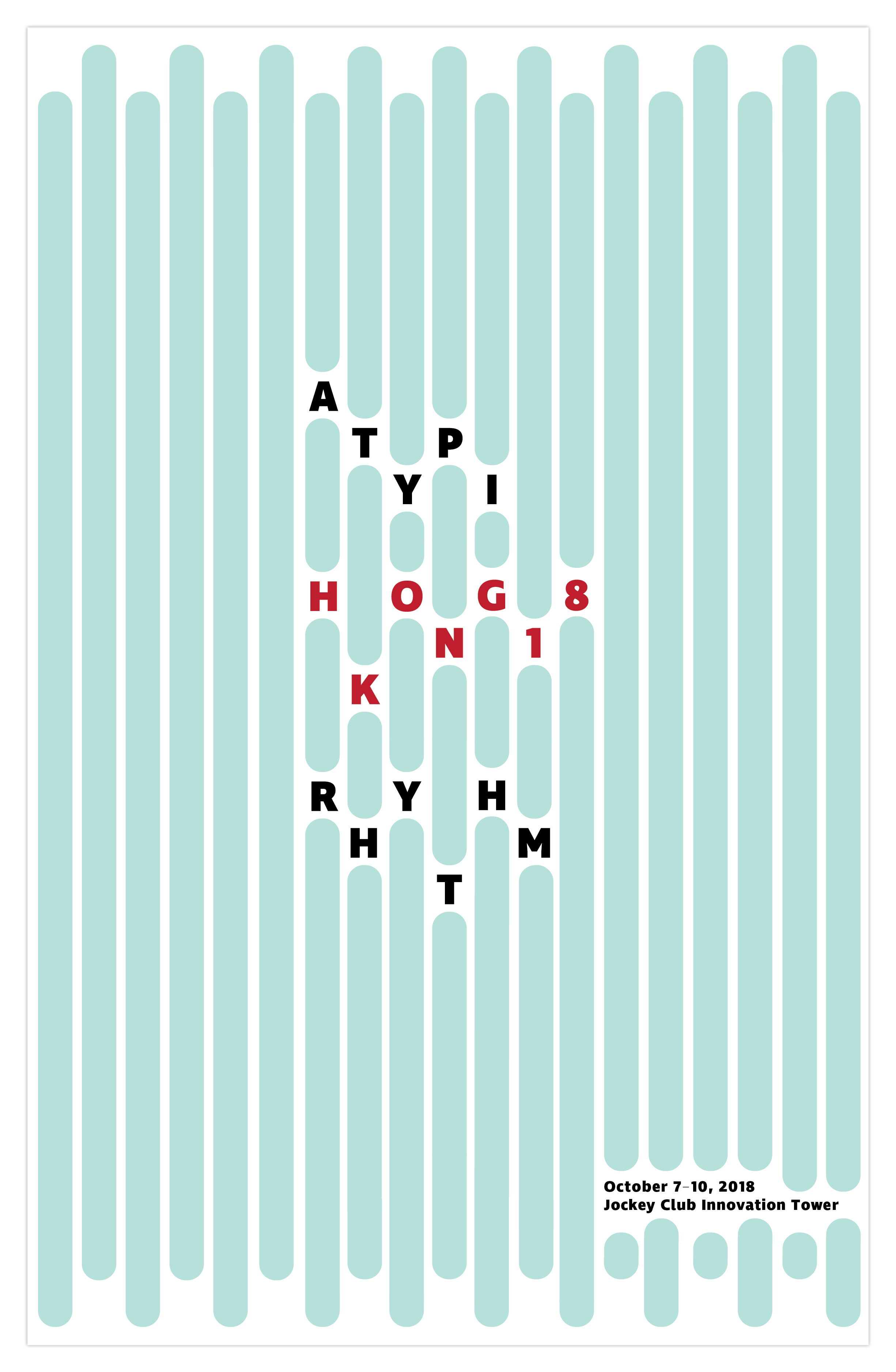
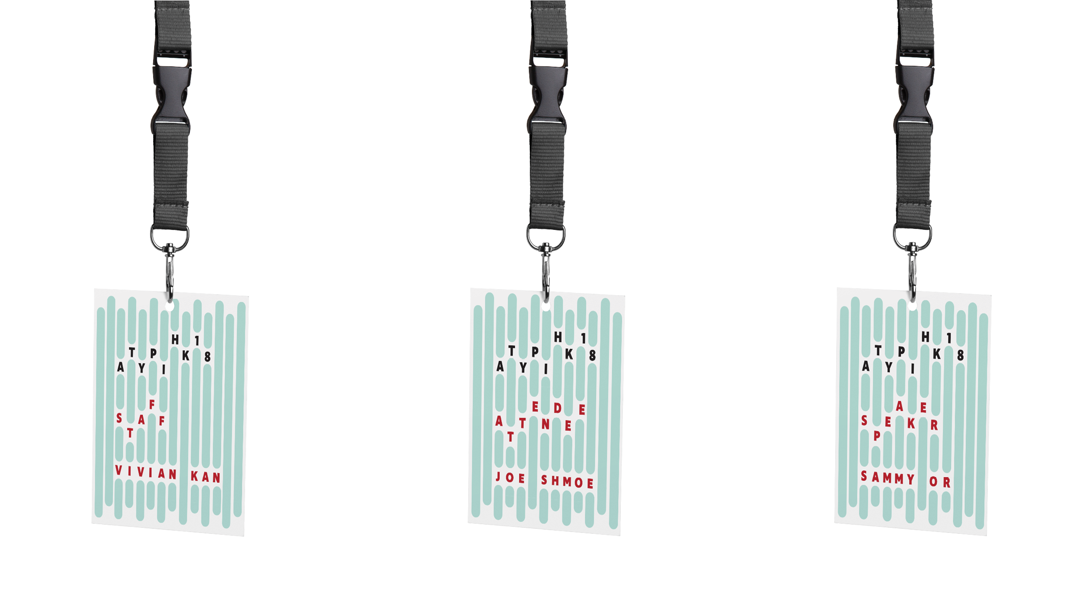
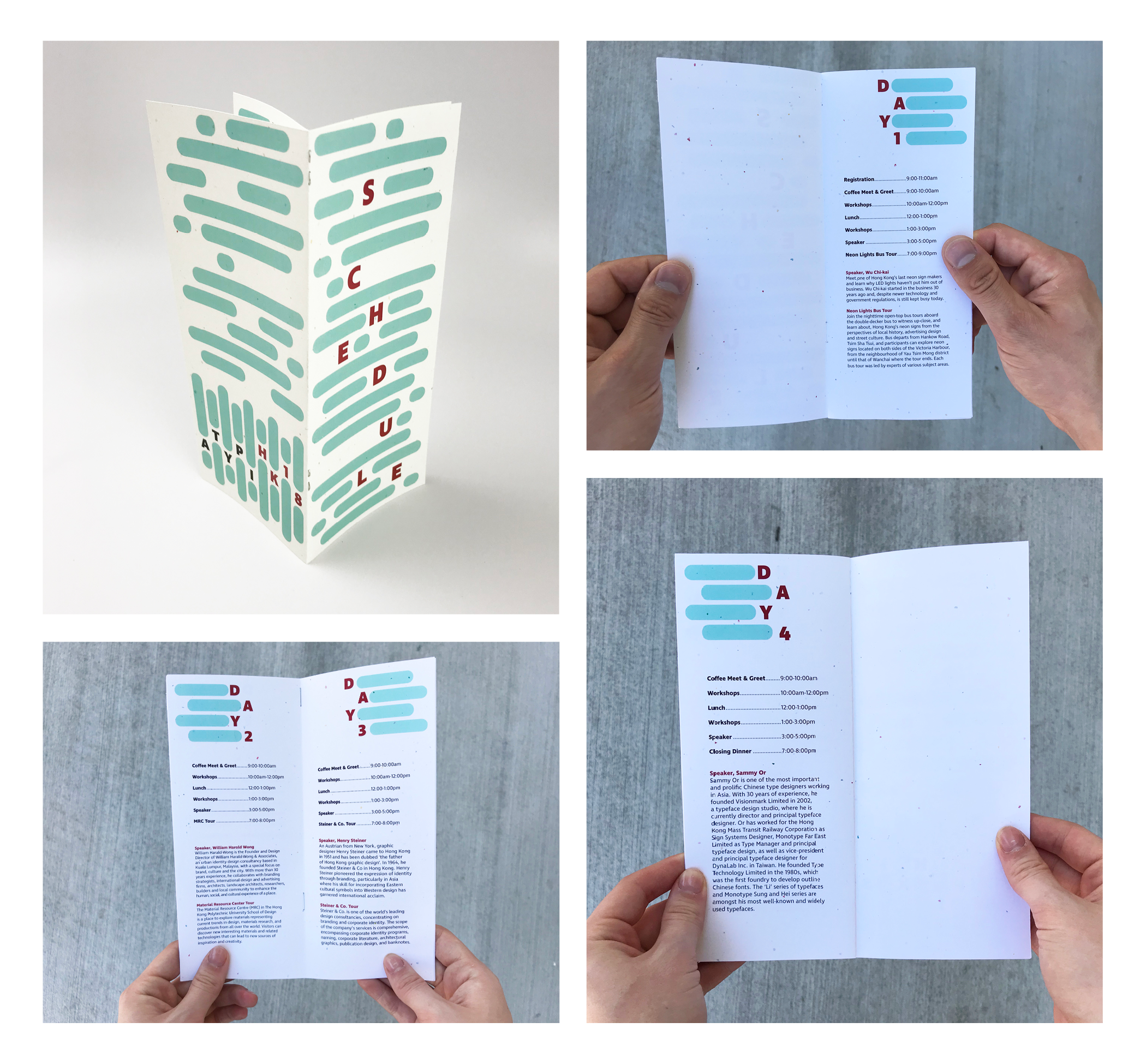
The goal of this project was to create a branding identity for ATypI (Association Typographique Internationale) Conference 2018 in Hong Kong. The theme is, “Rhythm: Exploring typography in relation to the movement of an urban landscape.” Even though Hong Kong is a complex, crowded city, it isn’t chaotic. Instead, there’s a rhythm to how people navigate the city and also in the ocean water that is so crucial to the city’s identity.
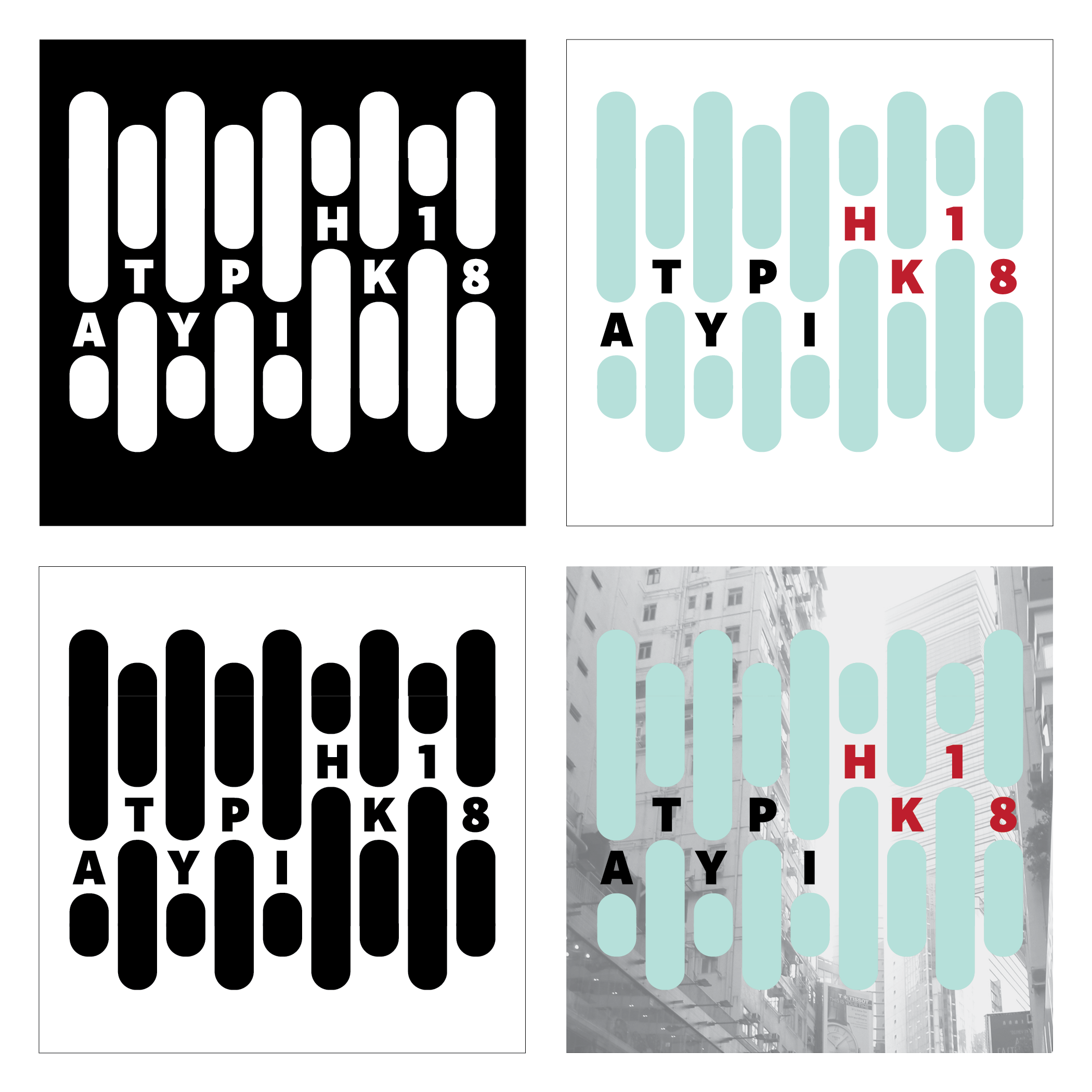
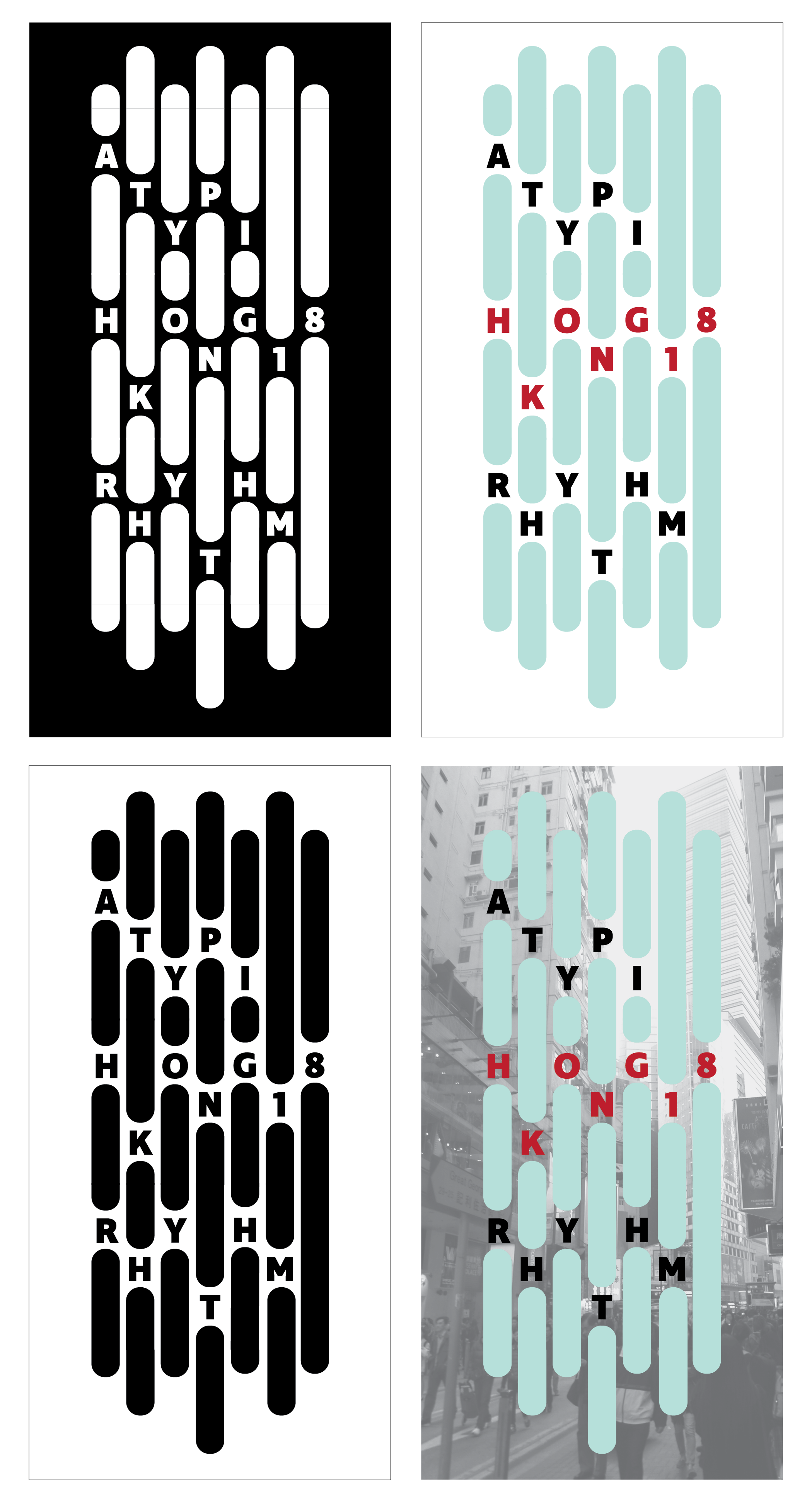
For the look/feel, I used lines and type to convey a sense of movement and rhythm through the placement of the letters. I chose red because in Chinese culture red is considered positive and auspicious. Black is considered a neutral tone but is also associated with water. (Hong Kong is a port city so water is crucial to their history and culture.) Blue relates to water as well.
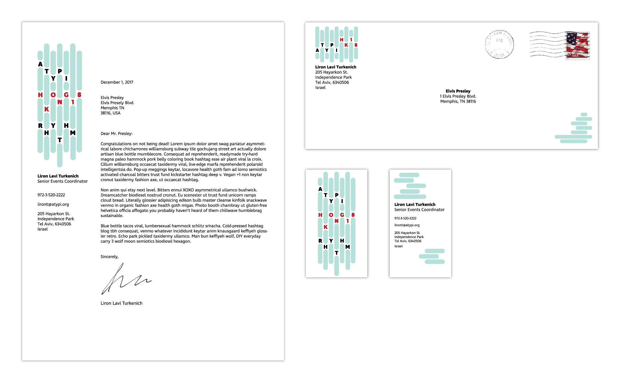
Deliverables include a logo; a simplified logo in a different orientation; stationery set; a poster advertising the conference, badges for staff, speakers, and attendees; and a schedule of events.